
...is a typeface which does include serifs on any letters, the little extra strokes found at the end of main vertical and horizontal strokes of some letters are called sans serif. Typefaces such as Arial, Helvetica, Futura are all sans-serif fonts. These fonts are used for basic word processed text and headlines.
SERIF...

 ...in typography, a serif is the little extra stroke found at the end of main vertical and horizontal strokes of some letterforms. Some are subtle and others may be quite pronounced and obvious. In some cases serifs may aid in the readability of a typeface. Serif refers, in general, to any style of type that has serifs.
 ROMAN...
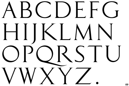 ...of the three main type classifications of typography, Roman is the style most in use. The others are Blackletter and Italic. Traditionally, Roman is a serif face based on a style of ancient Rome and is the typical classic serif of today. The most of obvious Roman typeface is Times New Roman.
Blackletter...
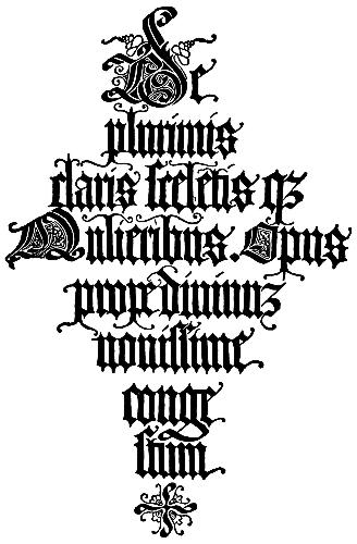 ...based on early written forms, blackletter is a style of typeface that features elaborate thick to thin strokes and serifs. The Gutenberg Bible, the first book ever printed with movable type, was set in a Blackletter typeface to mimic the manuscript writing of the time.Some of the main classifications of blackletter are textura, rotunda, and fraktur. Among these styles are a fair amount of variation.
 MODERN...
 ...in typography, Modern is a style of typeface developed in the not so modern 18th century that continued through much of the 19th century. Characterized by high contrast between thick and thin strokes and flat serifs, Modern fonts are harder to read than previous and later typestyles. Some examples of modern typfaces are Bodoni, Didot and Bernhard Modern Roman
OLD STYLE...
 ...in typography, Old Style is a style of font developed by typographers to replace the Blackletter style of type.Based on ancient Roman inscriptions, Old Style fonts are generally distinguised by low contrast between thick and thin strokes. Garamond, Centaur and Goudy Oldstyle are some examples of “Old Style” fonts.
...transitional or baroque serif typefaces first appeared in the mid-18th century, These typefaces have sharper serifs and a more vertical axis than humanist letters. When the fonts of John Baskerville were introduced in the mid-eighteenth century, their sharp forms and high contrast were considered shocking.